|
|
|
Архитектура Астрономия Аудит Биология Ботаника Бухгалтерский учёт Войное дело Генетика География Геология Дизайн Искусство История Кино Кулинария Культура Литература Математика Медицина Металлургия Мифология Музыка Психология Религия Спорт Строительство Техника Транспорт Туризм Усадьба Физика Фотография Химия Экология Электричество Электроника Энергетика |
Symptoms Of An Epidemic: Web Design Trends
· By Espen Brunborg
Since Elliot Jay Stocks so poignantly told us todestroy the Web 2.0 look, we’ve witnessed a de-shinification of the Web, with fewer glass buttons, beveled edges, reflections, special-offer badges, vulgar gradients with vibrant colors and diagonal background patterns. The transformation has been welcomed with relief by all but the most hardened gloss-enthusiasts. However, design and aesthetics work in mysterious ways, and no sooner does one Web design trendleave us before another appears. (Smashing’s note: If you are looking for a good book on mobile, this is the one. Our brand new book on best design and coding practices for mobile, Responsive Web design and UX design for mobile. Pre-order now and save 20%!)
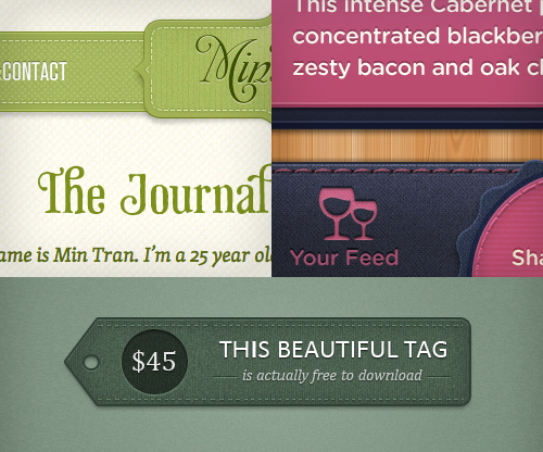
The Symptoms So, exactly what is this new epidemic? Well, let’s start by looking at some of the most common symptoms, many of which you have probably noticed. They are easy to spot, and as with many other conditions, they often appear in conjunction with each other. (This is why the contagion spreads so effectively — seemingly independent symptoms grow more infectious when combined with others.) Please note: The following list appears in no particular order and does not indicate the level of infectiousness or severity, which seem to be stable across the board. Note also that the instances given often exhibit more than one symptom, making classification more difficult. STITCHING Stitching appears gradually, often as a result of the designer playing too long with borders and lines, particularly of the dotted variety. A full-blown stitch is evidenced by the subtle shift from dots to dashes, augmented by drop shadows and other effects to give the impression of 3-D. The purpose of the stitch is somewhat elusive, but it seems to thrive in environments where certain textures are applied, most notably fabric and leather, but also generic graininess. While determining the exact cause of stitching is difficult, scientists are certain that it belongs to a larger strain of the infection known as “Skeuomorphism.”
ZIGZAG BORDERS Borders are common elements of Web design, and as such, they are difficult to avoid; luckily, they are usually harmless and often have a positive effect on the layout. However, for some reason, a particular type of border — the zigzag — has grown exponentially in the last few years and is now threatening the natural habitat of more benign border specimens. Exactly why this is happening is unknown, although some researchers claim that the pattern created by the repeating opposing diagonals has such an alluring effect on designers and clients alike that straight borders have somewhat lost their appeal.
FORKED RIBBONS Like borders, ribbons have long existed in various forms. What we’re seeing now, though, is the near dominance of a particular style of ribbon, easily identified by a fork at one or both ends. Some ribbons are also folded over twice, creating a faux effect of depth and reinforcing the diagonal lines in the fork. Whether the fork is related to the zigzag effect is unknown, but it seems that diagonal lines are the key to the ribbon’s survival, along with its ability to evoke memories of times past. The danger of the ribbon lies mainly in its ability to exist independent of other symptoms (although it thrives in the company of vintage typography), meaning that it could date your design long after the epidemic ends, even if the symptom itself appears dormant. In many ways, this is reminiscent of the “special offers” badge of the Web 2.0 look.
TEXTURES In the age of all things digital, it’s a conundrum that textures should dominate our illustrations and backgrounds, and yet they are indeed one of the most common symptoms on our list. Manifested by subtle grain, dirt and scratches, paper-esque surfaces and fold marks, they seem to embrace the spirit of the handmade. But ironically, they’re often the complete opposite: computer-generated effects or Photoshop brushes. Possible explanations for the widespread use of textures include a yearning for tactile media (especially considering the emergence of touchscreens) or envy towards print designers, who have a much richer palette of materials and surfaces to play with.
LETTERPRESS A Smashing Magazine article from 2009 outlined letterpress as one of the emerging trends of the year and, boy, were they right. The simple effect has gone from strength to strength and is now a household technique for sprucing up typography online. A relatively harmless symptom, letterpress might also have infected designers through other digital interfaces, such as operating systems and games, as early as the turn of the millennium, indicating a very long incubation period. Scientists disagree over whether the incubation period is due to the infection needing a critical mass before emerging from dormancy or whether the infection simply needed the right conditions — CSS3 text shadows, to be specific — for symptoms to appear.
Поиск по сайту: |